
James Strachan | Data Visualisation | #MakeoverMonday | 2020 | Week 36
Background
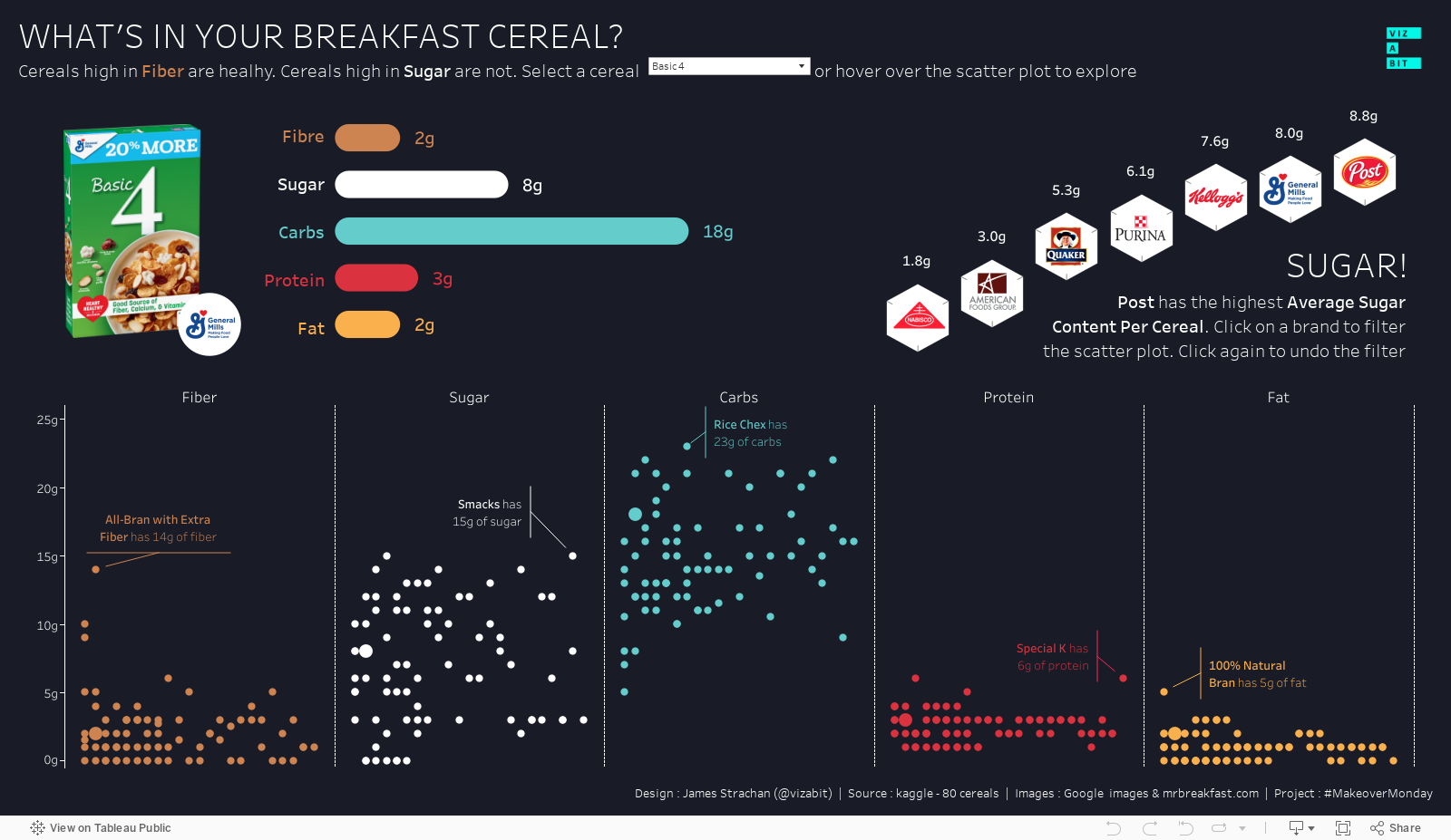
Ok, so I made it to two weeks in a row! This one was a little more complex in that it was about the nutritional contents of breakfast cereals. I knew it would be more work, but it definitely took much longer than anticipated. This was partly because it took time (trial and error) to figure out a design approach, but mostly (as we'll see below) because of all the manual work involved in preparing the graphics.
The #MakeoverMonday Original
This was deliberately designed to be ugly and break lots of data viz best practices, seemingly as the primary goal of the project is to coach analysts on how to create professional, easily digestible data visualisations. There's really nothing positive to take from it, so I decided to diverge from it immediately and just work with the data to develop my own approach. I knew broadly that I wanted to have some continuity of design ethos between last week's and this week's viz, but apart from that I was open to whatever felt most appropriate for this data set.

My #Vizabit Makeover
The thought process was long, complicated and iterative, but to try and summarise concisely here: 1) I knew I wanted to have a dark background again (continuity of 'brand' from last week); 2) I knew I wanted to show the data at a granular level (so there would be more to explore); 3) I knew I wanted to use graphics for the cereal boxes (as I didn't think others would go to the trouble of manually scraping these, so this would help my work stand out); and 4) I knew I wanted to do a bit of a deep dive on sugar (using the 'sugar cube' concept where possible, having seen a very stylish looking viz from @LunarModule7, which focused on this. When I finally finished and submitted the viz on Tuesday night, I was pretty exhausted. I wasn't completely happy with the mini sugar deep-dive in the top-right corner, but needed to put it down (I was neglecting my family)...
The Revision...
That night I watched Tableau Hall of Fame Zen Master Andy Kriebel's 'Watch Me Viz' video on YouTube before I went to bed, which was probably a mistake. I saw that he'd used a similar 'jitter' plot approach to spread overlapping marks, but also that his was so much better (and achieved so much quicker). That night I didn't sleep well, and woke up wanting to make revisions. From Andy I borrowed 'jittering' using Index() rather than AVG(Random()), which had the advantage of keeping the dots in alphabetical order from left to right and meant they were always broadly in the same place when highlighted in different dimensions. I created a parameter filter of the cereal names, as well as a simple T/F boolean if the name matched the parameter, and put this on size to help highlight the selected dots a little more by increasing their scale. At first glance you can barely tell the difference these changes made, but I knew it was better.
The main thing I really wanted to change though was the mini sugar deep-dive in the top-right. It looked muddled, confused, and out of place, spoiling the wider viz, and was difficult to understand at small scales (I like it when you can understand even a complex viz at a glance via a simple animated gif on twitter). Previously I had the logos, average sugar content by cereal and number of cereals each brand produced as 3 separate items. In the editing process I dropped the number of cereals (you can see in the scatter when you filter by brand), and combined the logos with the average sugar content per cereal stats, and the sugar cube graphic, and was very pleased with the end result). Now it felt less jarring, and more in-keeping with the rest of the viz. Here's the final dashboard:
The Cereal Box Images
Time vs Quality
So I think the point of #MakeoverMonday is that it is supposed to be quick. You limit yourself to 1 hour and produce the best, most complete piece of analysis you can in that time (as Andy Kriebel does). I'm using it differently though. I want the dashboards I publish to be as good as they possibly can be, and that means putting in the extra time. A previous manager once said "Don't let 'perfect' be the enemy of 'good'!", which is always a challenge for me, but my mantra has generally been more "quality not quantity", and I'm very OCD about details, which didn't help when it came to gathering and preparing the 77 cereal box images.
Scraping
Initially I thought it would only take an hour to find all the images, but it probably took closer to two. I'm not smart enough to use something like RegEx in Alteryx to do the heavy lifting for me. Google images was my friend (let's not talk about ensuring images are 'copyright free' just now), and also an excellent website called mrbreakfast.com. I didn't realise when I started that some of the cereals were old and no longer existed, so were difficult to find. (There's one I couldn't find at all, so had to use a generic icon for from flaticon.com, I wonder if you can find it on my dashboard). I also wanted to make sure the image quality was as good as possible, so spent some time looking at variants of the same cereal in some cases.
Formatting
Once I had them all saved (in a mix of .jpeg and .png files) I copied them all into a single PowerPoint slide and started formatting. This is all probably much easier if you have a Mac and Adobe Creative Cloud, but despite my wannabe creative aspirations I don't have those, so PowerPoint had to do. I wanted to re-size them all so they were a similar size and then re-save them all as .png with transparent backgrounds. To remove the white backgrounds from them was a bit of a challenge, not least because some of the cereal boxes were shown in 3D at an angle, so couldn't simply be cropped into rectangles as 2D images can. I tried a few different methods, but this is the one I ultimately used (primarily sharing here for Luther Flagstad who kindly showed interest in my viz and this process)
Build a frame and then 'Fragment Shapes'
The first thing to do is to create a 'frame' shape. To do this I just used box shapes of different sizes rotated to different angles and lined up around the edges of the 3D cereal box image. You can then use the 'Union' tool from the 'Merge Shapes' menu to combine these into a single shape. With this frame overlaid on top of the cereal box image, you then simply select the cereal box first (which is below), and then hold CTRL and also select the frame (which is above), and select the 'Fragment' option from the same 'Merge Shapes' menu. If you're going to repeat the process make several copies of the frame first (as each one will be fragmented). If the next 3D box is facing a different direction, simply use 'Edit Points' to adjust the frame to fit the new shape. Once fragmented, you can delete the 'off-cuts' and you're left with a beautifully custom-cropped image, neatly shaped around the 3D cereal box, which you can save as as a PNG. Then, when you load it in Tableau, selecting the mark will neatly highlight the custom edge.

Applying
Most people know how to apply the images in Tableau. You copy them all into a folder in your My Tableau Repository, then go into Tableau Desktop, put the dimension on 'Shape', then 'Reload the Shapes' and then manually assign the images one-by-one to the dimension values. The only painful bit here was trying to see which image was which from the tiny selector in Tableau (I wish they'd make these bigger, but they clearly don't expect analysts to use it in this way).
Resisting the temptation to overuse
Once I had all the images looking as crisp as I could it was then very tempting to use them in every chart, either as marks on a scatter plot (which would have looked horrible with overlapping cereal boxes!), or as a big filter / selection table of image (where each box would have been too small to read its title). As such, I was pleased I showed restraint, and just showed a single 'hero' cereal box, which then refreshed depending on the cereal being highlighted on the scatter plot.
Was it worth it?
Most people would probably say not, and I definitely don't want to spend that much time on #MakeoverMonday every week, but I am very pleased with the final result, and so if I had the time again, would probably follow a similar approach. Let's see what happens next week...


Comments
Post a Comment