
James Strachan | Data Visualisation | #MakeoverMonday | 2021 | Week 11
Introduction
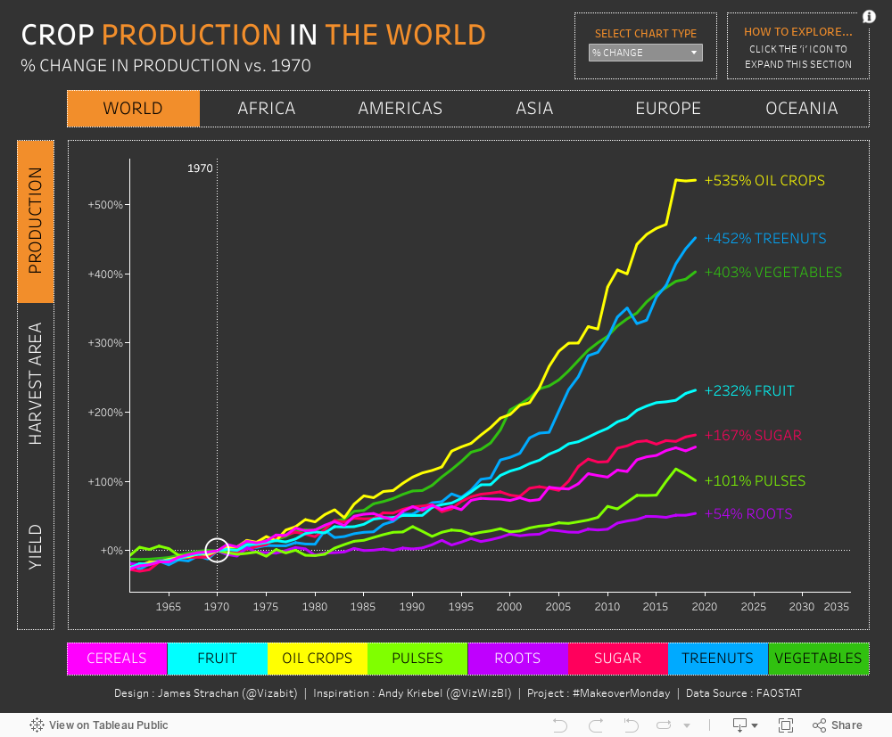
The data this week was production, harvest area, and yield volumes for a long list of crops across different geographic continental regions from 1961 to 2019.
The Information if Beautiful Original
I'm a big fan of David McCandless' work and like this one because it is clean and easy to engage with. It would be nice to be able to sort the bar charts at the top by the other column headings, and I wasn't sure where the data for the bubbles comes from (as Cannabis, Opium and Cocaine are suddenly the biggest bubbles, but this doesn't seem to correspond to the bar charts at the top), but otherwise I wouldn't claim to be able to improve this.

This week I was heavily inspired by Andy Kriebel's (@VizWizBI) example, where he built a single chart, but packed with parameter actions to select regions, metrics, and recalculate % change vs any selected year in a time period. Yu can watch his 'Watch Me Viz' video here. I liked this a lot, and wanted to practice parameters, so largely rebuilt his viz. I tried to improve on it slightly by padding the x-axis to allow me to label line ends with the full crop name, and adding a crop selector / colour key at the bottom. I also added another parameter to switch charts between 'absolute values' and '% change' values, and spent some time formatting a view for mobile as well.

Try it for yourself...
The version you see will depend on the device you are using.
Comments
Post a Comment