
Background
This was my first ever #MakeoverMonday data visualisation. However, I've been a Tableau user for several years, and am Tableau Desktop Professional Certified. Nevertheless, I was still nervous about submitting, as there are so many talented analysts in the Tableau community, that I thought my work simply wouldn't be good enough (impostor syndrome is something that I've always wrestled with).
The ESPN Original
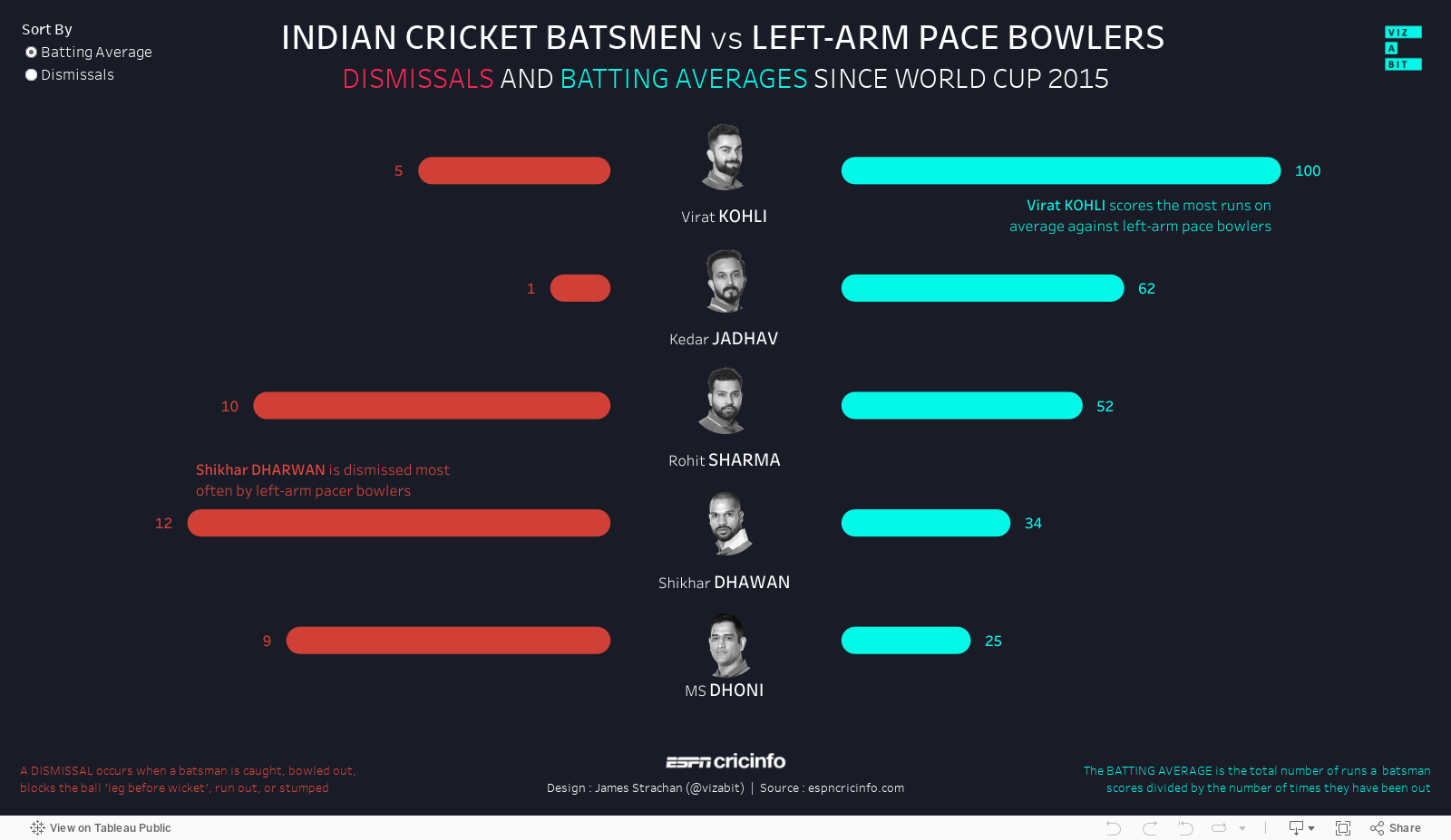
I was grateful to see that the data-set for this week's submission was very simple and the style of the original data viz by ESPN was an infographic, so the emphasis was simply on cleaning up and simplifying the viz. Broadly, I thought the colours and proportions weren't too bad, but a simple bar chart should have been used instead of the 're-sizing' player photos, which is more difficult to read:

My #Vizabit Makeover
I tried to keep some of the basic design elements I considered to be strong (the centred title, large fonts, dark background, limited colour palette). I chose a bar chart, but knowing there'd be lots of these, I spent a bit of time searching for images of the 5 batsmen, to help my submission standout a little and bring the data to life. Lastly, I created a little logo for my #vizabit twitter handle (ambitiously hinting my hope to viz/blog a lot more in future):


Explore the viz yourself...
Comments
Post a Comment