
James Strachan | Data Visualisation | #MakeoverMonday | 2020 | Week 37
Introduction
Three weeks in a row! In football that's a hat-trick! I was much happier this week. I spent a lot less time on the viz. I didn't bother with any manually scraped graphics or dashboard interactivity, as the data set was so simple I didn't think it was needed. As such I produced what I hope will be viewed as a clean, engaging, 1-page design, that communicates the key message from the data, whilst also showing all the underlying data points (as there are no hover over tooltips). The idea is that this could simply be copied and pasted directly into a PowerPoint slide, which is something that I still do regularly at work - people still like decks!
The #MakeoverMonday Original
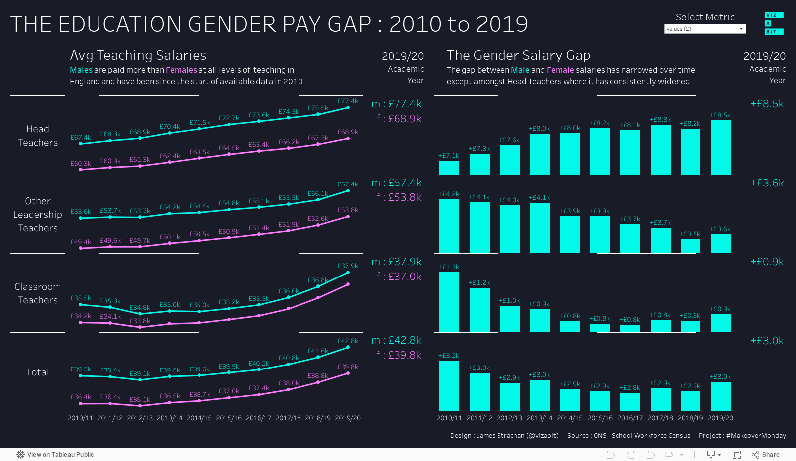
The theme this week was English teachers salaries based on survey data collected by the UK Government / ONS. The data could be trended from the 2010/11 academic year right up to 2019/20 (although the date field needed a little cleaning). It was also the kind of annoying pre-aggregated data-set, which I hate loading into Tableau, as there is so little you can do with it, and yet you still find yourself having to write calcs just to manipulate the data and draw charts the way you want. Much better to have raw data and let Tableau do the counting for you!
The style of the original viz (below) was typical of many government vizzes, which are technically correct, but poorly labelled, and difficult to read. It appeared to be generated automatically by an algorithm, rather than with any bespoke analyst involvement. The data set also contained different teacher grades, and most importantly gender, which (unsurprisingly) became the focus of my makeover (and many other analysts) as we all focused on the gender pay gap.

My #Vizabit Makeover
Firstly, I kept with what is fast becoming my trademark dark background and jade-led colour palette, as I continue to try and build a personal 'brand' of sorts. I may change in the coming weeks, but that was one less thing to think about.
I also stuck to the 16:9 PowerPoint dashboard aspect ratio. I like trying to design in a single port view that is legible both on most desktop monitors, and in landscape on most smart-phones. My new favourite hobby is scrolling through other analysts' #MakeoverMonday submissions on Twitter for inspiration, and it's good when you can understand a viz at a glance on a small device, even if the fonts can be a little hard to read (however, I hate it when people don't post a picture, but embed the dashboard instead - as jumping off to Tableau Public for a viz that invariably isn't formatted for a phone, and is slow to load, is no fun).
Anyway, back to me. I tried a few chart types, but in the end settled on simple line charts for the salary trends, and area charts for the gender pay gap. I chose to label all the data points, as I wasn't planning any interactivity like tooltips, and wanted the viewer to see any specific data point they wanted, but I still think it is a relatively clean design and the viewer isn't overwhelmed at first sight. It's not interactive, but here's the Tableau Public link anyway!

Blue For A Boy, Pink For A Girl
My family don't usually show much interest in my Tableau work. However, given the topic was gender related this week, and I'm surrounded by women (my wife and two daughters), we had an interesting debate about the use of colour. My view (which I ultimately ran with) was that I knew I wanted to use my trademark jade-blue, so this was probably best to represent boys, and that an equally luminous looking pink would be good for girls. I liked how well the two colours contrasted and jumped off the dark background. And I also felt that the traditional stereo-type of blue for a boy and pink for a girl, whilst increasingly challenged in modern society, is still a recognised visual short-cut for identifying gender. My girls on the other hand felt that my views were out-dated, that it was very politically incorrect to use blue and pink, and that I was running the risk of being publicly ridiculed for my choice. So far, thankfully, that hasn't happened...
Axis Padding
Once I'd alighted on my chart choices, I knew I wanted to zoom in on each trend line and accentuate the movements (as some grades were paid far more than others, so having them all on the same axis made it difficult to see the differences). To do this I set each axis to be 'independent' and unchecked 'include zero'. I hid the axes themselves for a cleaner look (which some would say is bad practice with different scales, but figured if I showed the labels I could get away with it). However, without zero, Tableau sets independent axes very close to the max and min data points in the view. To address this I remembered seeing a Tiny Tableau Talk on YouTube by @runski (Simon Runc) where he showed how to address this with calculations that were 110% of the Max value and 90% of the Min value used as invisible reference lines. This should have been simple, but for some reason I couldn't get it to work on a viz partitioned by grade. Spent about half an hour mucking about with various tableau calcs / LOD's, but in the end I simply broke each chart into 4 mini charts, and stacked them all in a vertical container. Overkill for such a simple viz, I know, but I got the look I was after. I subsequently saw this new YouTube video on comet charts by _Lorna_Brown of The Information Lab, which showed an even simpler way to do this using reference bands, which did work per pane, so I should have used this!
To Label Or Not To Label
A lot of analysts only labelled the min and max of the trend lines which definitely gives a clean look and is something I've used before. However, in this instance, I wanted to label all the data points, as I was hiding the axes and also because I wasn't planning to have any tooltips to reveal additional data. I also showed the latest year values a second time to the side of each chart in bigger font, partly to make them easier to read at a glance, partly to space the two line charts out a bit, but I also personally found it strangely reassuring to see the same value twice, as it gave me more me trust in the analysis - if the value appears twice it must be calculated correctly right? It's a subjective choice, but I'm happy with the way my viz turned out.
The Wood For The Trees: UK vs England
After I publish, I always have a mini-panic when I realise something wasn't quite right and have to re-publish. This time it was simply that I had referenced in the viz (both in commentary and in the source description) that this was UK data, when in fact it was only for England. I was so immersed in trying to make this look beautiful that I had missed this rather simple, but important distinction. I immediately corrected it and re-published to Tableau Public, but was also reassured to see that @VizWizBI also made the same mistake! :)
Possible Improvements
Although I slept much better after submitting this, ideas for how to improve the viz still pop into my head. Stylistically there were some very creative vizzes that looked like chalk hand-writing on school blackboards, which I thought was genius! Secondly, as well as showing the absolute values on both charts, I could also show the YoY % change. Then I could use a parameter control to let users switch between these metrics, as @VizWizBI did on 'Watch Me Viz'. And then I could animate it, and put a little animated gif on twitter... or... I could just be kind to myself and say this one is done... Yeah, I think I'll do that instead!
Epilogue
So I lied, I came back to tinker with this one just a little bit. Added a parameter to let the user switch between absolute salary values and YoY % changes. Then applied chart animations to smooth transitions between states. A little frustrated with limited control over label placement when different parameter values selected, but will just have to live with that...

Try it for yourself...
Comments
Post a Comment