
James Strachan | Data Visualisation | #MakeoverMonday | 2020 | Week 39
Introduction
This week was a Viz5 week in association with Operation Fistula. A Fistula is a childbirth injury that happens when a woman who needs a C-section doesn't get a good one in time. After losing her child the woman is left with an injury that devastates her life. It is particularly common in African countries. Operation Fistula aims to prevent this. #Makeover Monday supports this important cause, and so periodically looks at data sets about specific aspects of gender inequality to draw attention to them through data visualisation. This was my first time completing a Viz5 project. The topic is serious, so the tone of my viz needed to be as well, so I opted for a different colour palette, which I may re-use for future Viz5 weeks to create a sub-set of sorts within my main portfolio. I also noticed that a lot more analysts participate in the Viz5 weeks, so the number and standard of submissions is generally a lot higher. Challenge accepted!
The Operation Fistula / Viz5 Original
Once again the original data visualisation was broadly fine this week. However, it didn't feel very impactful to me (which was perhaps the point), so I aimed with my viz to try and land the key messages loud and clear...

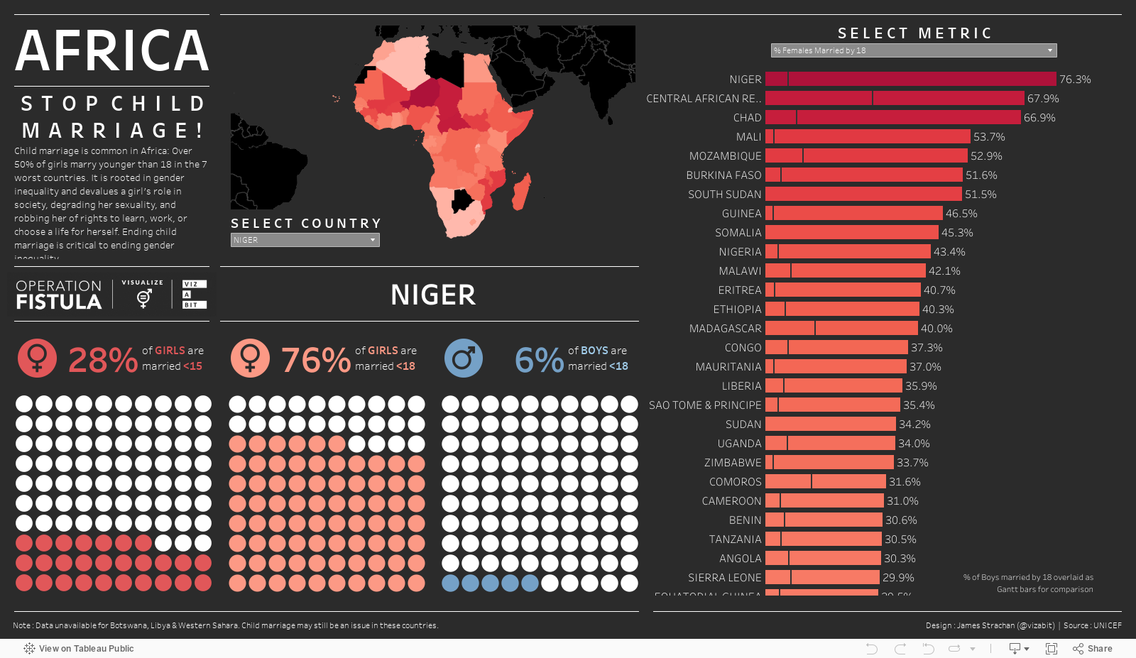
The data set (from UNICEF) was again very easy to work with this week. 128 Low or Middle Income Countries (LIMC) were included (importantly not the whole World), and there were just 3 metrics: i) % of girls married <15; ii) % of girls married <18; and iii) % of boys married <18. I decided very quickly to narrow my focus to just the African countries (where the issue is worst), and that I wanted to use 'waffle charts' to represent the %'s in each country. ('Waffles' are a custom chart type that is not native to Tableau, however, they are easy to build. I've never had cause to use them before at work, which is why I was keen to try them out on #MakeoverMonday). I also knew I wanted to try out the 'device designer' functionality in Tableau to customise my dashboard for both desktop and mobile port views. Again, this was not something I'd done before at work, and so was something I was keen to explore this week.
Countries & Continents
The first thing to do was narrow down the list of countries. Fortunately, Tableau recognised all the countries instantly and was able to plot them on a map (no data manipulation required). To group them into continents I found it easier to Google a list from the internet and join this to the original data set. I could have used the 'lasso' selector on the map to just grab all the African countries together and group them, but I find this fiddly, and my geography isn't great, so my way was easier for me and gave me more certainty that I'd included all the right countries. One important thing I learned though, was that I needed to change the join so that it wasn't being done in the 'Logical' layer (the new 'relationship noodles' in Tableau, which I guess is like a temporary table); but instead had to be done in the 'Physical' layer (i.e. an actual join creating an actual data table), which it took a little while to find in the new Tableau navigation. The reason I needed to do this is because when I built the Waffles I couldn't filter the waffle chart with a dimension (i.e. country) from the secondary data source (unless it existed entirely in the 'Physical' layer).

Building Waffles
There are tonnes of great tutorials online and on YouTube for this, so I won't repeat them here. Suffice it to say you just need a secondary excel sheet as a scaffold, which lays out the position of each dot in 10 rows of 10 columns, then you order the rows and columns in the direction you want the dots to be coloured in, and create a simple True/False boolean calculation to determine whether the % from the data, was higher that the % in the scafford (if True then colour it in). Here's a link to Andy Kriebel's old YouTube tutorial, which still stands the test of time 3 years after publication!

Mobile First: Publish, Publish & Publish Again!
What did I learn from attempting mobile-centric dashboard designs? 3 things primarily: i) Tableau will automatically detect what type of device you're on and show the appropriate version of the viz; ii) I don't think you can show a chart on the mobile version, that isn't on the main version (so if I wanted mobile specific versions of my charts, I had to make copies of them, format them for mobile, but then float them on the main desktop view, shrink them to a tiny size (say 10 x 10 pixels), and then hide them behind another floating object (say my 'viz-a-bit' logo, which is usually in the top-right corner). Then it doesn't show on the desktop view, but is available for selection on the mobile view. Lastly, and perhaps most importantly iii) dashboards don't appear on Tableau Public exactly the same as they do on Tableau Desktop. Often perfect formatting on Tableau Desktop will lead to text being cut-off on Tableau Public. And given my audience is consuming from Tableau Public, this is where it needs to be perfect. So the only way to solve this to me seemed to be to keep tweaking font sizes, container sizes and inner/outer padding and repeatedly re-publishing to Tableau Public so I could check how it looked on my phone. A lot of trial and error, but I got there in the end. As frustrating as this was, it is a mobile-first world these days, so I think it is important to do. So much so that I subsequently went back and added mobile views to some of my previous week's vizzes.
The #Vizabit Redesign
So here's what the final dashboard looks like on a desktop device:

And here's what it looks like on a mobile phone:

Try it for yourself...
The view you see will depend on the device you're using
Comments
Post a Comment