
James Strachan | Data Visualisation | #MakeoverMonday | 2020 | Week 40
Introduction
This week it was also Tableau Conference-ish (a fully virtual version of Tableau's annual 3-day conference, due to ongoing Covid-19 restrictions). As such, the #MakeoverMonday crew wanted everyone to viz together this week, and to set themselves a strict 1-hour deadline. I failed on both counts, and only just published my viz on Sunday morning (just before Week 41 was released). In part this was because the data set was large and complex, and it took me time to work out what I wanted to do. Essentially the data was 'chained' (inflation adjusted) GDP for every US state and county from 2001 to 2018, which was obviously a lot to work with!
The Howmuch.net Original
At first glance the original breaks all sorts of data viz best practices. The map is laid at an angle; the spikes are like a 3D bar chart; and spikes in different places may appear larger/smaller even if they are actually the same size. However, I think the viz does get a few things right: i) they cut down the data set to just focus on 2018 (the latest available year); ii) the chart choice clearly illustrates the mass of wealth in California and New York; and iii) I liked the use of the colour green, as this very directly reminds me of the colour of US dollar bills.

Hex-Maps
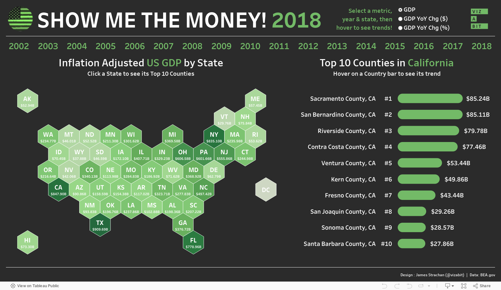
I chose hex-maps for the US state map. These were popular amongst many analysts and are a good choice, not just because they look cool, but because they are more compact than true geographic maps, so you don't need to filter out outliers like Alaska and Hawaii to get the map to fit. They also work particularly well for the US, which has an instantly recognisable visual shape. I'm not convinced they'd be such a good choice for Europe or the UK for example. There are several different ways to build hex-maps in Tableau. The one Tableau encourages in their e-Learning is to use the in-built Hexbin-X and Hexbin-Y calculations, but these require hard-coded (rather than 'generated') latitude and longitude values, and even with the use of a parameter sizer it can be difficult to get the hexagons to tessellate perfectly. An alternative is to use software like Alteryx to generate custom polygons that tesselate perfectly. I do use Alteryx at work, but don't have it on my personal device, so rather than hop back and forth between machines to create my own, I simply Googled and downloaded a shape file from Joshua Milligan (@vizpainter)'s blog. (This is where the Tableau Community is so helpful, as someone, somewhere has always done the hard-work for you!) Then it was simply a case of joining the shape file to the main data set on State, and then hiding the map background (as the hexagons automatically show up somewhere in Africa for some reason) and voila!

Imitation is the sincerest form of flattery
Full disclosure, I was so slow getting my viz together this week, that by the time I got round to it there were already lots of great submissions, and in particular I was heavily influenced style-wise by this great example from Data Dan. I loved his use of green; his padded hex-map; his faint background dollar bill image (look carefully); and his font choice (which looks to match the style of a dollar bill)

Although they look very similar at first glance, my dashboard differs from Dan's in a few key ways. Firstly, I used a parameter to switch between GDP; GDP YoY Chg ($); and GDP YoY Chg (%). Secondly, I included a year selector at the top, so you can explore historic data. And, thirdly, as with previous weeks, I also created a mobile-centric view as well. Here's what mine looks like on desktop:

And here's what the mobile version looks like:

Try if for yourself...
The view you see will depend on the device you're using
Comments
Post a Comment